Blogger Template Design: Tutorial 8
- Tutorial 7: Setting the Template Size
- Tutorial 9: More Explanation about the Body Code
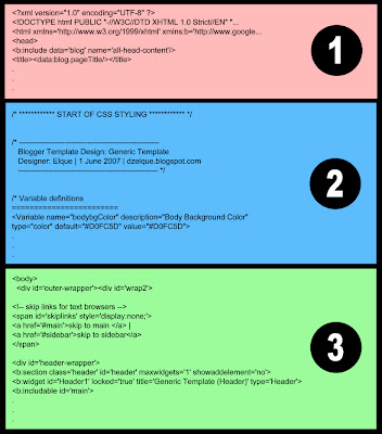
Refering back to the tutorial Blogger Template Code Structure, the Body code is in Section 3 as shown in the image below.

Shown below is the Body code copied exactly from the Blogger Edit HTML page with the 'Expand Widget Button' unchecked. I do not want to include the complete code by checking the 'Expand Widget Button' for 2 reasons. First, it's not necessary to do this. You actually don't even have to know what goes on inside the complete code to be able to design a properly working Blogger template. That's all been done 'automatically' by Blogger, which is the beauty of using this new Blogger template as oppose to the old classic ones. Second, by looking at this simpler version of the code, you'll be able to grasp easier the main idea of how all the containers in the template are laid out.
<body>
<div id='outer-wrapper'><div id='wrap2'>
<!-- skip links for text browsers -->
<span id='skiplinks' style='display:none;'>
<a href='#main'>skip to main </a> |
<a href='#sidebar'>skip to sidebar</a>
</span>
<div id='header-wrapper'>
<b:section class='header' id='header' maxwidgets='1' showaddelement='no'>
<b:widget id='Header1' locked='true' title='Testpage Two (Header)' type='Header'/>
</b:section>
</div>
<div id='content-wrapper'>
<div id='main-wrapper'>
<b:section class='main' id='main' showaddelement='no'>
<b:widget id='Blog1' locked='true' title='Blog Posts' type='Blog'/>
</b:section>
</div>
<div id='sidebar-wrapper'>
<b:section class='sidebar' id='sidebar' preferred='yes'>
<b:widget id='Profile1' locked='false' title='About Me' type='Profile'/>
<b:widget id='BlogArchive1' locked='false' title='Blog Archive' type='BlogArchive'/>
<b:widget id='Label1' locked='false' title='Labels' type='Label'/>
</b:section>
</div>
<!-- spacer for skins that want sidebar and main to be the same height-->
<div class='clear'> </div>
</div> <!-- end content-wrapper -->
<div id='footer-wrapper'>
<b:section class='footer' id='footer'>
<b:widget id='Text1' locked='false' title='Blogger Template | Bordr' type='Text'/>
</b:section>
</div>
</div></div> <!-- end outer-wrapper -->
</body>
For simplicity, ignore the code in light grey. They are either comments or 'default' codes to make things work properly that doesn't need to be tampered with. The core part of the codes can be sectioned into 4 parts:
- Header (in red)
- Main (in green)
- Sidebar (in red)
- Footer (in brown)
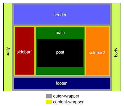
Inside this large container, you'll see 3 wrappers - header-wrapper, content-wrapper, and footer-wrapper. They are positioned vertically with the header-wrapper being at top and the footer-wrapper being at the bottom. It's simply because in the code, the header-wrapper is called first, followed by the content-wrapper, and finally the footer-wrapper. At this point, you don't even have to know what's inside the content-wrapper - this makes it much cleaner and easier as oppose to not having the content-wrapper and having to deal with the main-wrapper and sidebar-wrapper together all at once. It'll be a big mess then.
Because the outer-wrapper is the largest wrapper, you have to make sure that the widths of all the other wrappers inside it is less or at least equal to the outer-wrapper's width. But, if you add borders, that'll add extra pixels to whichever wrapper that you're adding the borders too. So be careful when adding borders!
Adding a new wrapper (container) in between any of these wrappers is easy. Just paste in a wrapper code (see below for example) and rename it with a new name, say a banner-wrapper. The preferred='yes' command will make an 'Add Page Element' button that'll allow you to create new widgets.
  <div id='banner-wrapper'>
     <b:section class='banner' id='banner' preferred='yes'>
</b:section>
  </div>
Adding a wrapper only creates a new container, or block, in your blog. In doesn't set how it's going to look or where it's going to be located. To customize how it looks and where it's located in the blog, you NEED to tweak the CSS codes.
Inside the content-wrapper, you have the main-wrapper and sidebar-wrapper. To have these two wrappers side-by-side as commonly seen in blogs, you have to set the widths of these 2 wrappers such that it's equal or less than the width of the content-wrapper. Plus, you have to add certain commands in the CSS Styling code so that they'll sit next to each other. Otherwise, they'll just fall vertically on top of one another. Typically, you need to use the 'float:left' command for this. See some template examples to check more on this. If you want to add more sidebars, say a 3-column template, you simply need to add more sidebar-wrapper code (in blue). Read more in Tutorial 10 to know how to add or change sidebars.
Once you've understood the basic idea behind the Body code, it's easy to see now why the common structure of the Blogger template code looks the way it is (see below for a 3-column example). If you want to rearrange or add new containers or wrappers, what you simply need to do is to modify the Body of the code. It's that easy! But then, you have to tweak the CSS code to set how it's gonna look in the blog.

***************************************
Next Tutorial:
More explanation about the Body section of the code is given in Tutorial 9.
No comments:
Post a Comment